![]()
Learn how to analyze data faster, extract business insights smarter, and present your work better. All while making it look so easy!

All the key performance indicators (KPIs) in the world – WITHOUT CLEAR INSIGHTS- won’t help you deliver the message and won’t make your work stand-out!
When you prepare your data reports, you don’t need to be comprehensive and present everything you extracted. You don’t have to be committed to a specific layout or structure and struggle to fit your insights in it.
When you regularly present data to busy decision-makers who get bored & disengaged by repetitive indicators & scattered graphs; you need to clearly show what’s happening in your business, why it’s happening, and what to do about it.
“Organizations who use visual data discovery tools are 28% more likely to find timely information than those who don’t.”
Aberdeen Group

Your message is only as good as your ability to share it.
You need to transform from aimless data reporting to purposeful insights presentation. It’s time you tell a story and give insights around your numbers & graphs to provides value and motivate people to listen and engage.
It’s time to stand-out and develop your career. It’s time to use Data Visualization!
We, in Powerful Insights (PI), have created a workshop to help professionals working with data create an interactive dashboard using Microsoft Power BI.
Microsoft Power BI Workshop will help you:
1. Understand and gather data requirements
2. Analyze the data in a purposeful and insightful way
3. Create an interactive dashboard to engage your audience
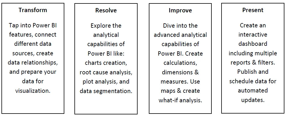
And will take you on a data visualization T.R.I.P©:
Why Microsoft Power BI?
Gartner index indicates that Microsoft is the data visualization market leader for the past 4 years, and that is for obvious reasons:
- – It’s a self-service user-friendly tool to find data without the help of I.T. staff.
- – It’s highly interactive and has a wide variety of charts, slicers, and filters.
- – It can handle a large amount of data.
- – It can restrict the data view to individuals by setting.
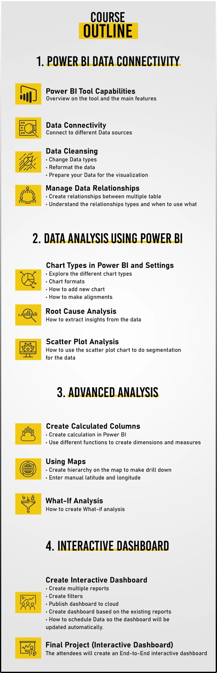
In the Mircosoft Power BI Workshop, you will:
- – Learn how to use Microsoft Power BI to extract insights from the data and visualize it in a simple and clear form.- Learn how to identify data relationships and patterns to identify areas that need attention or improvement.
- – Learn how to connect to different data sources.
- – Learn how to perform data cleansing (change data types, reformat data).
- – Learn how to create charts, calculations, dimensions, measures, and maps.
- – Learn how to perform root cause analysis.
- – Learn how to create multiple reports & filters, and how to schedule data for automatic updates.
- – Create an End-to-End Interactive Dashboard as your final project.
Watch The Course Introduction Video